Overview
ALOUD Archives is a cultural program by the Library Foundation of Los Angeles dedicated to preserving and sharing recorded public talks with prominent figures in art, literature, and film.
Our work with ALOUD focused on improving how users discover and navigate this rich archive through its website.
Role
Product Designer
Timeline
Aug 2024 – Dec 2024
(10 weeks)
My Responsibilities
UX/UI Design
Visual System
UX Research
Design Thinking
Team
Lois Kim
Michelle Cheng
Celia Choi
Arthur Jensen
My Impact
I worked alongside three other designers to develop a more user-centered web experience for ALOUD Archives.
I conducted an expert interview with Esperanza Bey, an LFLA archivist, and uncovered key insights about how users approach searching and categorizing content. I translated these findings into a tagging system that aligns with user mental models and improves user retention.
I also identified and implemented a Google Sheets-based prototype to organize both existing and future media. The tagging system establishes a scalable framework for internal workflows and ensures consistent tagging as the archive grows.
Problem
Solution
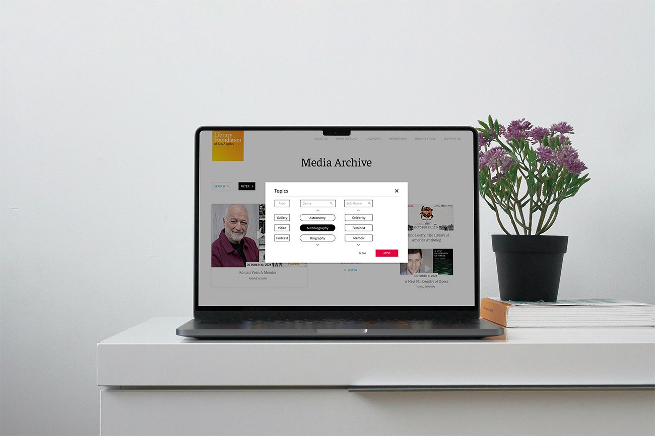
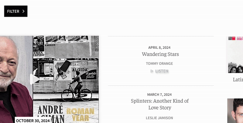
We designed a dynamic tagging and filtering system that allows users to browse recordings by media-type, genre, and sub-genre.
KEY FEATURES
Media Type Filters
Genre Filters
Sub-Genre Filters
OUTCOME
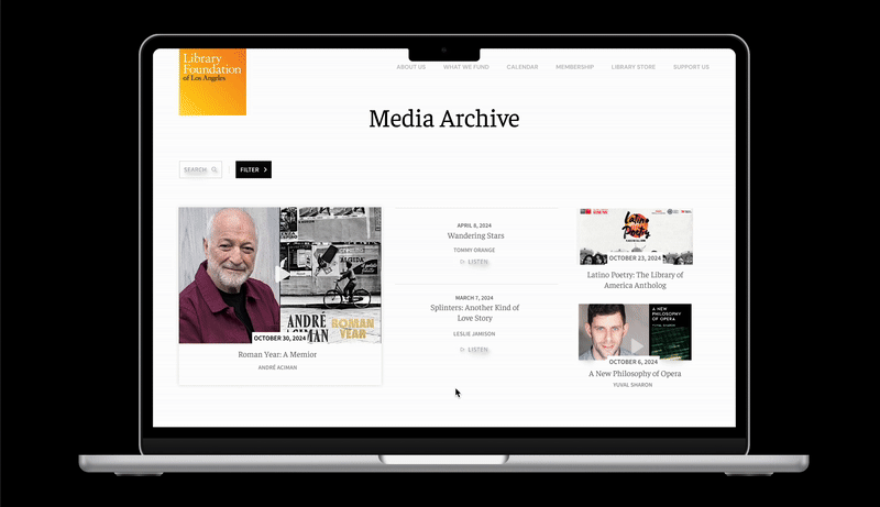
This solution helps users quickly find relevant content, explore areas of interest, and stay engaged longer with the archive's collection.

Media Type Filters
Quickly narrow content by format—such as gallery, video, or podcast—to make browsing more efficient.
Fast Content Discovery
Simplified Browsing
Supports Multiple Formats
Genre Filters
Filter talks by broad categories like Autobiography, Mystery, etc. to find content that matches user interests at a glance.
Targeted Exploration
Improved Content Relevance
Easy Navigation
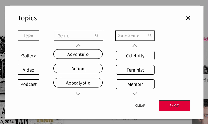
Sub-Genre Filters
Explore more specific topics within each genre to uncover niche content and hidden gems.
Granular Navigation
Enhanced Discoverability
Supports Focused Exploration
Design Approach
We focused on creating a filtering system that gave users more control over how they search and explore the archive. Since the archive already supported browsing by media type, we refined that feature and introduced genre and sub-genre filters to add context and depth. Together, these categories make exploration easier and more engaging for a wider audience.
Based on research and testing, our design focused on simplicity, handheld comfort, and clear visual feedback.
User Research Survey
We conducted a survey with 32 regular ALOUD Archives users to understand how they interacted with the website and what challenges they faced. The findings highlighted issues with clarity and discoverability, reinforcing the need for a more structured system of filters and categories.
Expert Insights
Our conversations with the LFLA team and external professionals highlighted the importance of clear organization, user-focused tagging, and long-term resource management. These insights led us to design a flexible system for organizing both existing and future content. Doing so would allow ALOUD to scale while making it easier for users to discover and engage with vast amount of content.
Testing Organization Methods
We conducted two card sorting activities to understand user priorities and mental models:
Feature prioritization: Participants ranked what they looked for most in the archive. Results showed that users want more context before engaging with the content.
Content grouping exercise: Participants organized event content using only titles and thumbnails. Difficulties here confirmed the need for clear contextual cues like genre and sub-genre.
These exercises directly informed our filtering and tagging system, so that our designs were aligned with user expectations and behaviors.
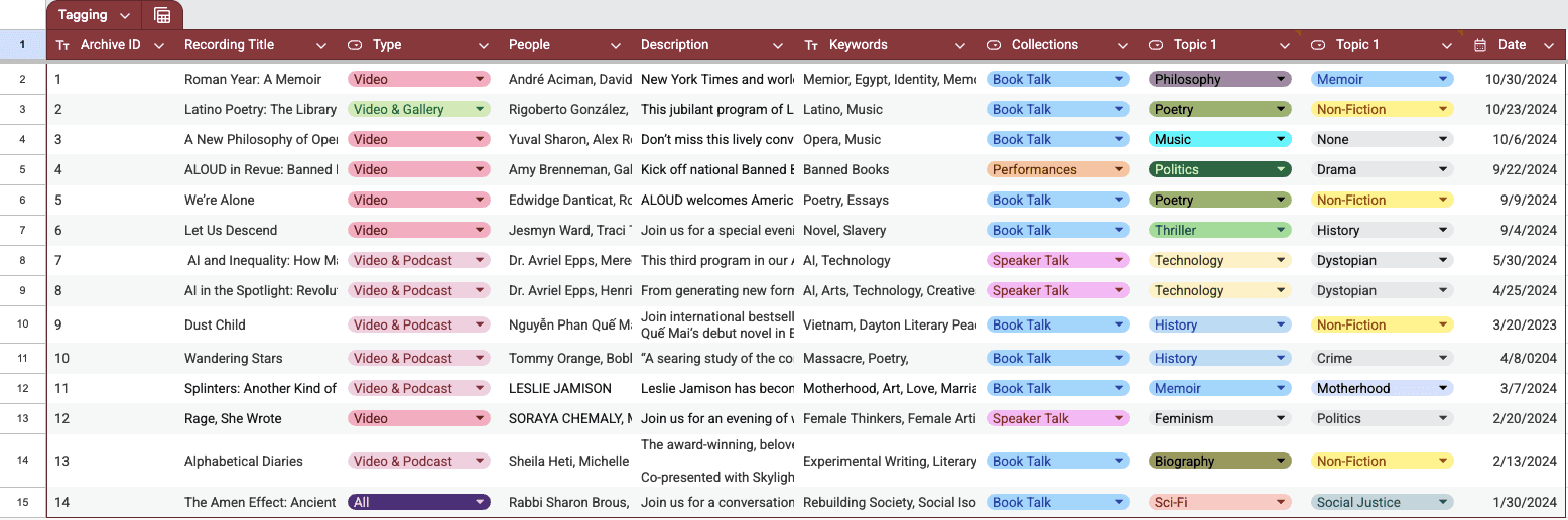
Internal Organization Prototype
To support consistent tagging across ALOUD's extensive catalog, we developed a sample tagging system in Google Sheets that breaks down each talk into key components. This prototype demonstrated a scalable approach for organizing both existing and future content to make it easier for the internal team to maintain consistency.
REFLECTION
What I Learned