Echo Park Embark
Overview
We started from one strong belief: that in today's world, new and memorable experiences constitute our true personal luxury. We are convinced that these unique moments are what enrich our lives and leave a lasting impact. So here's to the memories in the making, to those extraordinary experiences that become the stories we cherish and share.
Role
Vintage Everything
Team
Creative Direction
Timeline
2021
My Contributions
Photography Branding

Problem
A wall of static buttons.
Current AAC tools force users into deeply nested grid folders. Every word requires 3-5 taps, making real-time conversation slow.
Slow Navigation
It takes users a long time to find the word or phrase they need. Finding a single word requires digging through layers of folders.
Rigid Vocabulary
Users have to pre-program uncommon words. When something unexpected comes up, they don't have the vocabulary ready. The system doesn't adapt to the present moment.
Difficulty to Physically Access
AAC devices are housed in bulky, uncomfortable cases that carry a distinct "medical look." For young adults, this clinical aesthetic creates social discomfort

Opportunity
Shifting the paradigm from searching to selecting.
The friction of traditional AAC isn't just a software limitation or a hardware flaw. It's a system design failure. By designing the adaptive interface and the physical chassis in parallel, we saw an opportunity to eliminate conversational drop-off entirely.
Instead of forcing users to dig through a "wall of static buttons" while their conversational partner disengages, an integrated ecosystem could capture ambient context to accelerate speed, respect user muscle memory, and project confidence.
Solution
A hybrid ecosystem built for fluid, real-time connection.
Digital component: Voxai app
An adaptive interface that retains the familiar, color-coded Fitzgerald Key structure but deploys ambient context to bubble up vocabulary right when it's needed, shattering the 3–5 tap barrier.
Physical component: Dual-display case
A minimalist, lightweight case paired with a 360° rotating handle and an outward-facing rear screen that displays text as it's typed to help keep communication partners visually anchored.

core flows
Minimal friction, maximum autonomy.
The final design addressed three core user needs: typing support, conversation support, and expression support.
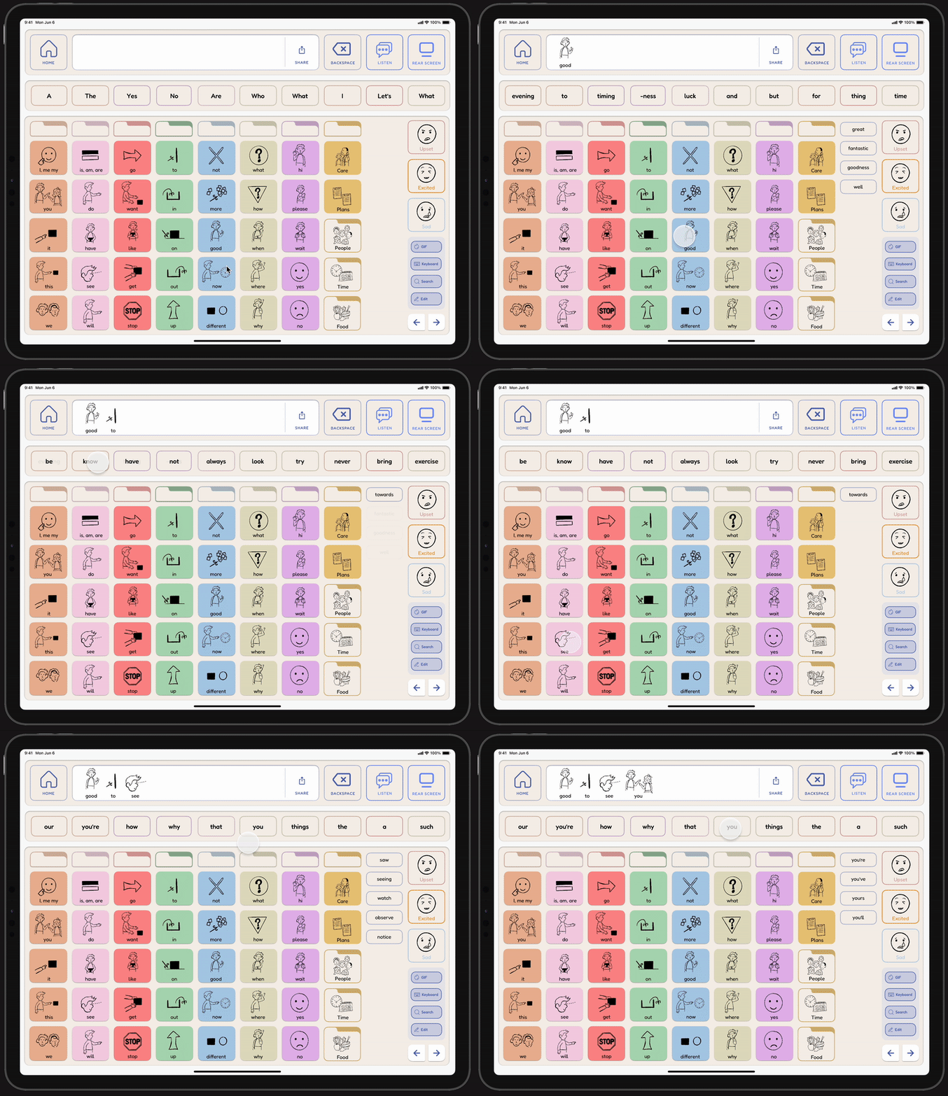
Contextual Navigation
The predictive word bar dynamically re-orders daily vocabulary based on routine habits and geolocated proximity, keeping core language a single tap away.

Smart-Phrase Assist
VoxAI parses environmental audio to generate three immediate, context-aware phrase suggestions to handle unexpected conversational turns.
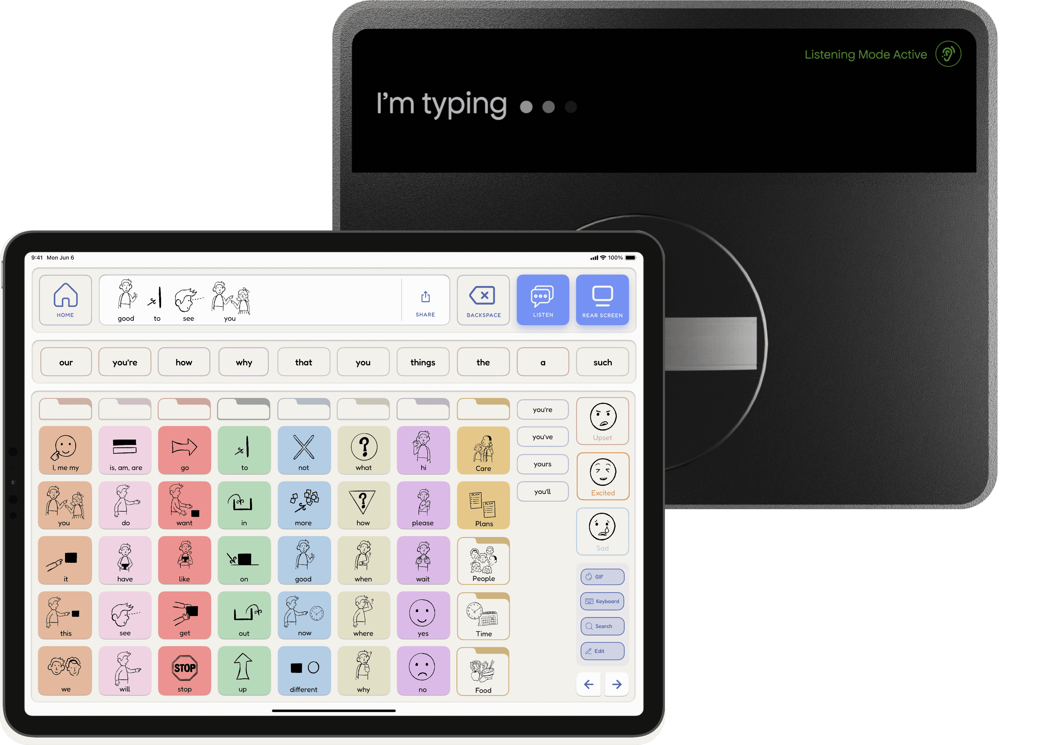
Dual-Display Sync
Text entered on the primary screen instantly mirrors onto the rear display, broadcasting conversational intent in real time.
Research
Uncovering the realities of daily communication friction.
We conducted deep-dive interviews with 8 primary caregivers, collaborated with a certified Speech-Language Pathologist, and backed our approach with secondary clinical literature regarding the sensory and cognitive profiles of young adults with nonverbal autism.
Designing for Autism: Core Principles
From secondary research, we established four non-negotiable framework criteria to guide both the digital and physical architecture:
Predictability and Navigation
Simple, structured layouts reduce cognitive load and make AAC tools easier to use.
Sensory Sensitivity
Muted colors prevent overstimulation while keeping the interface visually engaging.
Multiple Modes of Communication
Offering both symbols and text supports accessibility for varying literacy and user preferences.
Flexibility and Adaptability
Customizable systems accommodate the unique physical and cognitive needs of each individual.
Mapping the Conversational Drop-off
To visualize exactly where these principles break down in real-world scenarios, we mapped out the user journey during a typical public social interaction.

Primary User Insights
Autonomy over automation:
Users do not want an AI to speak for them. They want a system that surfaces their own intended vocabulary faster.
visibility prevents abadonment:
When a nonverbal user takes 15 seconds to compose a sentence, listeners frequently look away. Maintaining visual engagement is a critical requirement for mutual connection.
THE USER
Designing for young adults with non-verbal autism.
They are transitioning into independent environments (college, internships, and social settings) where speed and social integration are just as important as the communication itself. Unlike children's AAC tools, these users want a device that feels like a personal tech accessory rather than a clinical aid.

EXPLORING FORM FACTORS (The hardware)
Redesigning the physical case from sensory overload to conversational visibility.
We treated the physical enclosure not as a protective accessory, but as a core interface. Our form factor exploration moved through two distinct rounds of physical prototyping to solve the tension between ergonomics and social comfort.
Round 1: Designing for Ergonomics and Portability
What we tried
Our early prototypes included a strap, textured side grips, and a foldable stand. The goal was to make the device easier to hold and use across different orientations.

What failed
User testing completely upended our physical assumptions.
The textured side grips triggered severe sensory sensitivities.
The straps restricted natural hand adjustments.
The foldable stand only supported landscape mode.
how we pivoted
We stripped away the sensory noise entirely. We replaced the bulky kickstand and restrictive straps with a single 360° rotating mechanical handle. This lightweight, minimalist chassis allowed users to fluidly swap between landscape and portrait layouts depending on their environmental needs.
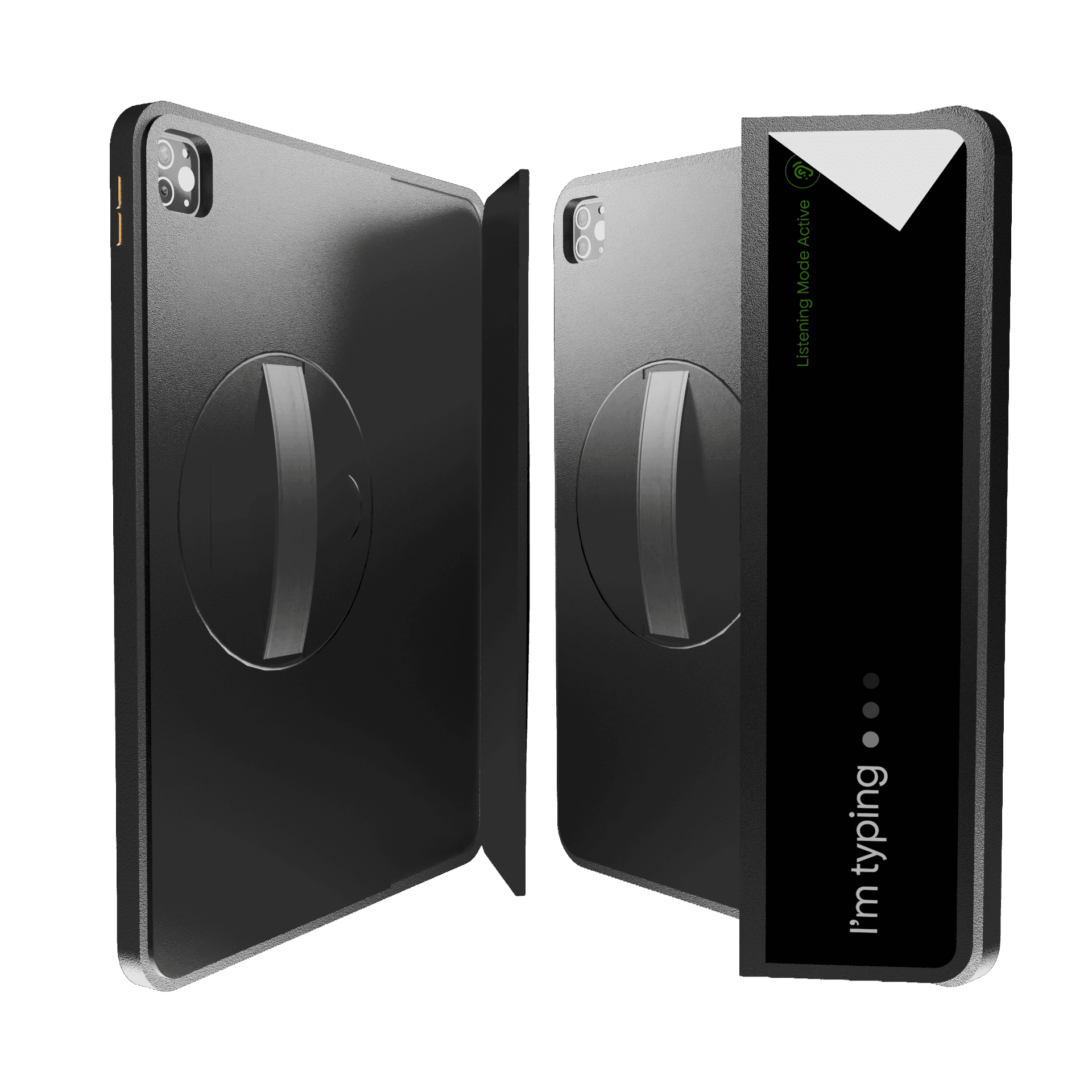
Round 2: Integrating a Rear Screen
By removing the bulky traditional kickstand, we realized we had freed up the entire back of the device enclosure.
New discovery
Caregiver observations showed that during the 15–20 seconds a user spent navigating or typing, the conversational partner would consistently look away, break eye contact, or entirely disengage.
how we pivoted
We utilized this newly open hardware space to introduce a secondary, outward-facing display. This screen dynamically mirrors text as it’s typed and transform the back of the case into an active communication canvas that keeps partners anchored.
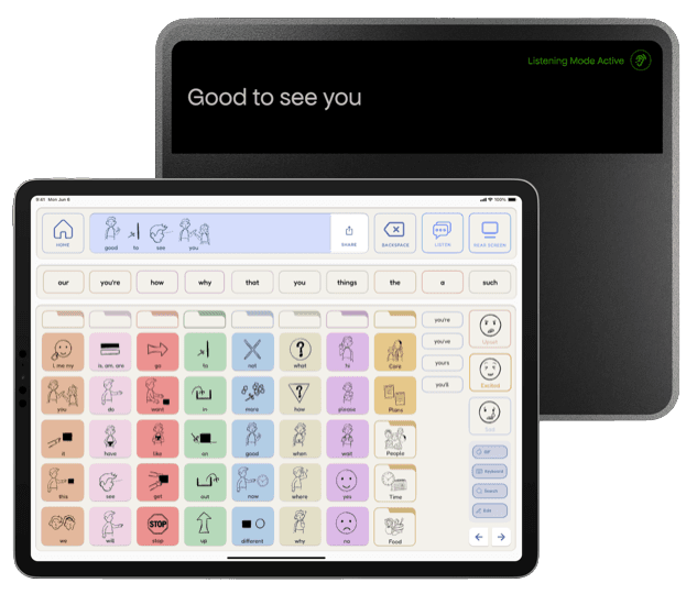
Prototyping and Testing (The digital interface)
Balancing automated speed with user autonomy.
In parallel with the hardware, the digital interface went through dozens of digital prototyping sprints. The primary digital challenge was accelerating communication speed without stripping away the user's cognitive control or violating their existing muscle memory.
Iteration 1: The Button Layer and Visual Noise
Early digital wireframes featured an ambitious custom feature: utilizing generative AI to create highly personalized, unique imagery for every single vocabulary button to match a user's specific lifestyle.
What we tried
A first look at our early wireframes, mid-fidelity screens, and initial drafts. Early explorations centered around these features:
AI-generated word prediction informed by user habits and geolocation.
AI-generated images for custom buttons to make communication more personalized.
Conversation recording which could suggest entire phrases for the user to respond with.
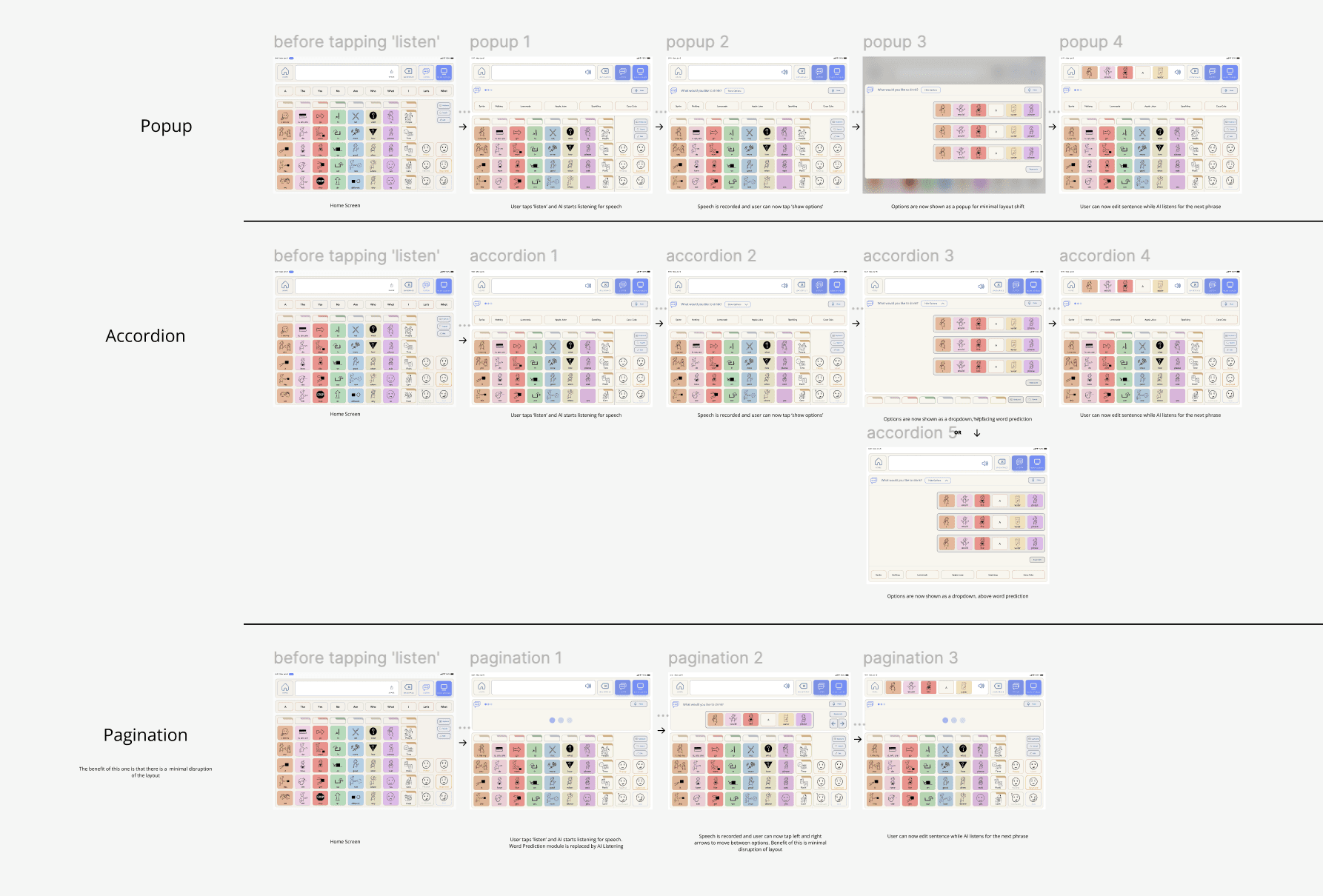
What failed
Heuristic evaluations and user testing showed this created massive cognitive overload. Rapid AAC communication relies entirely on stable visual spatial memory (knowing exactly where a button is and what it looks like instantly).
Dynamically changing or overly complex imagery:
Destroyed pattern recognition.
Slowed down processing speeds.
how we pivoted
We got rid of the generative imagery feature and went back to a clean, standardized, and stream-lined line icon system. To honor the user's hard-coded muscle memory, we mapped these icons strictly over the traditional, color-coded Fitzgerald Key system layout.

Iteration 2: Navigating the tension between ambient sensing and privacy.
Because live phrase assistance requires listening to environmental context, the system introduces potential privacy concerns for both the user and their partner.
What failed
During role play testing, an invisible system felt deeply invasive and unpredictable. Because there was no clear feedback showing when or what the system was processing, users felt a loss of autonomy, and communication partners expressed privacy discomfort.
how we pivoted
We added a clear indicator on the hardware's rear screen that signals to the conversational partner exactly when the system is active.
Reflection
Key Takeaways
Ground research in real user needs
Designing for non-verbal autistic users taught me that accessibility goes far beyond making things "usable." Every design choice had to be grounded in research and real sensory considerations. This also reinforced a broadest best practice that designing with accessibility in mind benefits all users, not just those with specific needs.
transparency breeds trust
Predictive systems can easily feel invasive. Giving users explicit visual indicators of when the system is listening, paired with a physical screen that shares that context with the listener, transforms technology into a transparent tool for mutual connection.